
General Information
The use of mobile devices (e.g. smartphones or tablets) for surfing the internet has increased enormously in recent years and is still on the rise. This makes the optimization of websites for mobile devices a duty for every webmaster. The goal is an adequate presentation of the website as well as its complete usability on mobile devices.
Mobile SEO Checker
Check if your web page is optimized for mobile devices
The “mobile friendliness” of a website is now also an important ranking factor for Google. Google has even announced that the mobile search index will become Google’s main index. This “mobile first” index makes the mobile version of a website considerably more important, as it is primarily used for indexing.
For certain sites (e.g. restaurants, local shops, etc.), mobile optimization is particularly relevant, as Google prefers sites for local search queries that work well on mobile devices (as such search queries are often made via mobile devices).
Special characteristics of user behavior on mobile devices
Before dealing with the specific aspects of mobile optimization, you should first understand the peculiarities of user behavior on mobile devices, as these are the baseline for mobile optimization.
An important special characteristic, for example, is that navigation on mobile devices is not carried out with a mouse, but via touch screen or voice control. In addition, mobile devices in most cases have a much smaller display, which severely limits the display options. In addition, Java or Flash can usually not be displayed and users usually have a slower internet connection. In addition, users are very impatient when it comes to mobile surfing and the desired information must, therefore, be available quickly and in a concise form in order to satisfy users.
Requirements for a “mobile friendly” website
Before we explain the technical aspects of mobile optimization, we first want to mention the criteria that a website should meet in order to be considered “mobile friendly”.
First of all, you should make sure that all texts of your website are readable (without zoom) on all devices. You also have to adapt all other elements of your page to the different display sizes in order to avoid that users have to zoom or scroll horizontally. You should also make sure that there is sufficient space between links or buttons so that they can easily be touched with a finger without touching the wrong link. Also, you should avoid the use of software which is not available on all devices (e.g. Flash) for reasons of user-friendliness.
Aspects of mobile optimization
Basically, there are three main possibilities for the configuration of a mobile website. These are
- responsive web design
- the creation of a separate mobile website and
- dynamic serving.
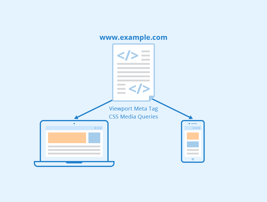
Responsive web design
With responsive web design, the HTML code and URL of a website remain the same for all devices, but its content automatically adapts to the screen size. Responsive web design is the approach to mobile optimization recommended by Google and only has the disadvantage that not all content can be adapted to different display sizes. Within responsive web design, the display area of a page is configured by a viewport meta tag, which provides information about the scaling of the page width:
<meta name="viewport" content="width=device-width, initial-scale=1.0" />
In addition, you can use media queries in CSS for responsive web design to define the display of your page depending on screen size.
Mobile version of a website
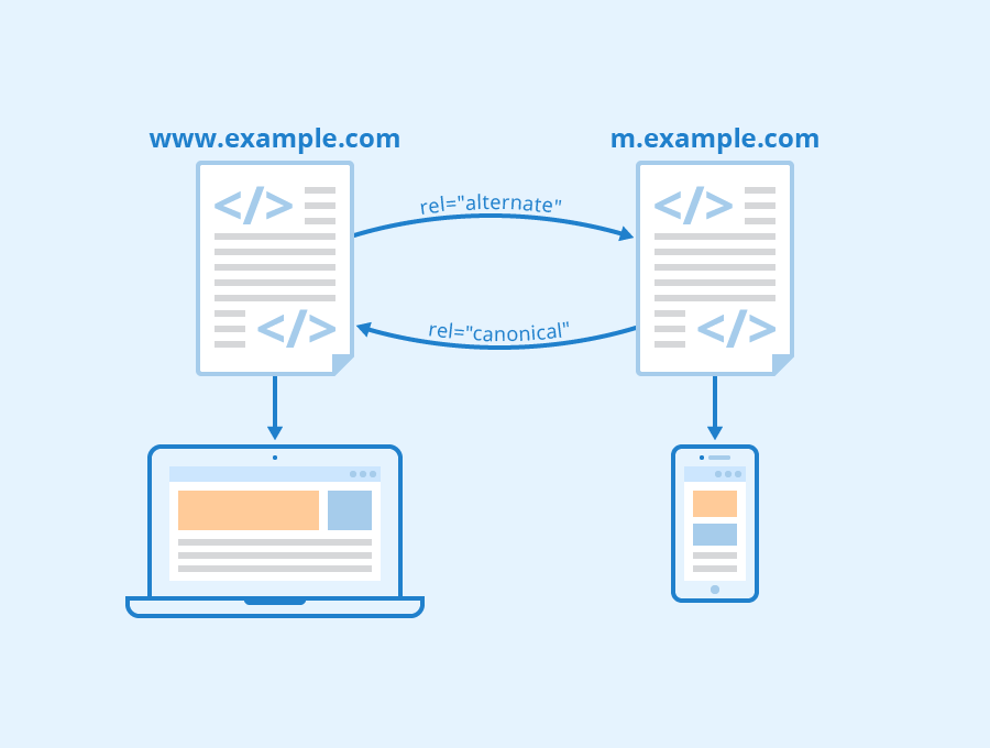
The second of the above variants is to create a separate mobile version of your website, which has its own URL. In such a case, if users access your website from a mobile device, they are redirected to the mobile version of your page using HTTP redirects. However, the disadvantage of this alternative is that it can cause problems with duplicate content.
To make it easier for Google to evaluate the different URLs, you should add a rel=”alternate” tag to the HTML code of the desktop version of your URL. This tag points to the mobile version of the URL:
<link rel="alternate" media="only screen and (max-width: 640px)"

href="https://m.example.com/">
In addition, you should add a canonical link to the mobile version of your page, which refers to the desktop version, in order to prevent said problems with duplicate content:
<link rel="canonical" href="https://www.example.com/">
Dynamic serving
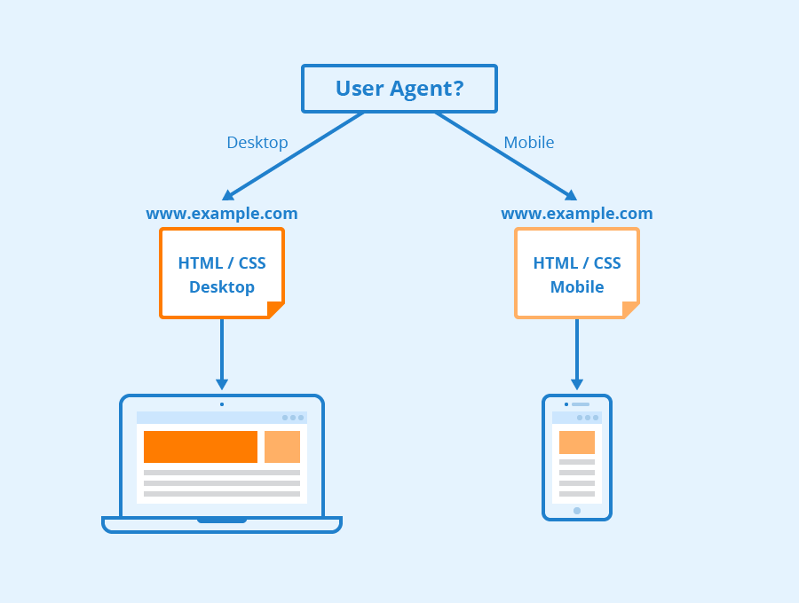
The third and final alternative for configuring a mobile site is dynamic serving. If you choose this variant, different HTML and CSS codes are delivered depending on which user agent is recognized. In this case, the mobile site is a reduced version of the actual site. The main disadvantage of this alternative is the high error rate in the identification of the user agent.
An important element in this approach is the vary HTTP header. Through this, the server sends a message that the Googlebot for smartphones should also crawl the corresponding page. Without the vary HTTP header, Google wouldn’t know that the HTML code for mobile user agents is being modified. This header could look like this:
GET /page-1 HTTP/1.1

Host: www.example.com

(...rest of the HTTP request header...)
HTTP/1.1 200 OK

Content-Type: text/html

Vary: User-Agent

Content-Length: 5710

(... rest of the HTTP response header...)
Further aspects of mobile optimization
An important part of mobile optimization is the speed optimization of your site by reducing the amount of data to be transferred. This is possible, for example, by minimizing CSS and JavaScript files. You can do this by minimizing the code of the respective files on the one hand (e.g. by removing line breaks) and, on the other hand, by combining several individual files of one file type into one overall file, so that fewer requests are necessary to load a page. Furthermore, you should use as few images as possible for mobile websites, as these cause significantly longer loading times. If you cannot do without a certain image, you should try to compress it or provide a separate image for the mobile version of your page (this is also possible for responsive web design). In addition, you should limit videos, sound files and other multimedia elements to the absolute minimum.
In addition to speed optimization, the adaptation of the page menu to smaller screen sizes is an important aspect of mobile optimization. Here, you should also avoid so-called hero headers. Don’t forget to adjust font sizes, too, so that users can read the text on your pages on smaller screens without zoom.
Furthermore, with the meta tag “rel=icon” you can define an icon, which is displayed when users add your page to the home screen of their mobile devices. This meta tag looks like this:
<link rel="icon" sizes="192x192" href="/icon.png">
The touch icon for Apple devices has its own meta tag:
<link rel="apple-touch-icon" href="/apple-touch-icon.png" />
In addition, you should always inform Google that your site is optimized for mobile devices or that a separate mobile site exists. You can do this with a rel=alternate tag or canonical link for mobile versions of your site or with the vary HTTP header for dynamic serving.
Last but not least, in addition to all these technical aspects, you should always be aware of the situation in which users access your content and which functions are relevant for them, and keep these aspects in mind when you design your site.
Frequent errors
You should avoid the following frequently occurring errors regarding mobile optimization:
- Interstitials that cover the entire content of your page, resulting in problems with the indexation of your mobile site and in negative user experience. Here you should use banners instead.
- incorrectly configured redirects (e.g. users are always redirected to the mobile homepage and not to the corresponding subpage)
- The user agent is not recognized as a mobile device.
- loading times that are too long (these cause users to exit)
- font size that is too small
- touch elements that are too small and too close together
- Videos that cannot be played on mobile devices (e.g. Flash videos). To avoid this, you should always integrate videos using HTML5 standard tags and provide video transcripts in case errors occur.
Helpful Tools
Google itself provides two helpful tools to support webmasters in mobile optimization of their site.
This includes, on the one hand, the mobile-friendly test. This tool tests how easy it is to use your site on mobile devices and provides a list of problems found (e.g. small font sizes, etc.). In addition, the test result contains a screenshot that shows what your site looks like on mobile devices.

Screenshot with an exemplary result of the mobile-friendly test from search.google.com
The second tool Google provides is PageSpeed Insights. This tool allows an analysis of the speed of your site on different devices and gives tips for optimization.
Related links
Google provides webmasters with very extensive and detailed information about mobile optimization:
- https://www.thinkwithgoogle.com/marketing-resources/experience-design/speed-is-key-optimize-your-mobile-experience/
- https://developers.google.com/search/mobile-sites/mobile-seo/
- https://developers.google.com/search/mobile-sites/mobile-seo/common-mistakes
- https://developers.google.com/search/mobile-sites/mobile-seo/responsive-design
- https://developers.google.com/search/mobile-sites/mobile-seo/dynamic-serving
- https://developers.google.com/search/mobile-sites/mobile-seo/separate-urls
Similar articles
