
Definition
Media queries are a CSS3 function that allows you to specify the display of a document for different output media and screen sizes. The display is adjusted according to certain conditions such as media type, screen orientation or screen resolution. Since June 2012, media queries have been a standard for responsive web design recommended by the World Wide Web Consortium (W3C).
What are media queries used for?
An essential part of responsive design is creating the right user experience for each type of device. Media Queries make it possible to respond to a client browser with a customized display of a web page based on inherent properties of the device it is running on. Before a webpage is loaded and displayed by a browser, this media information is retrieved via media queries. The big advantage of CSS media queries is that appropriate resolutions and screen sizes do not have to be specified for each individual device. CSS media queries thus offer an easy way to align web pages to more than one type of output device and are therefore an important part of mobile optimization and responsive web design.
How do media queries work?
CSS media queries consist of an (optional) media type and one or more expressions called media features. Multiple queries can be combined by logical operators. Media queries are introduced with “@media” and assign a CSS block to a page only if the following conditions are met. Media queries are used to query media type (smartphone, tablet, printer, TV) and media characteristics such as screen orientation, resolution, height, width, or colors, and, as a result, to set breakpoints.
Querying media types via media queries
CSS for a certain output device can be defined on the basis of media types. However, querying the media type with media queries is optional. If no media type is defined in media queries, the default value “all” automatically applies. The most common values for media types are “screen” for computer screens, tablets, and smartphones, “print” for controlling the print output of a website, and “speech” for output on a screen reader that reads the content aloud.
Example code for querying the media type:
@media screen {
/* CSS code for screen output */
}
Querying media features via media queries
Media features are expressions that set one or more requirements for an output device, which must be met in order to include the CSS resources. Media features include, for example, orientation, height, width, and resolution of a display. An expression is true if the feature is met, and false if it is not. If multiple media features are defined in one query, all must be true for the entire query to be true.
Example code for querying the media feature “landscape”:
@media all and (orientation: landscape) {
/* CSS code for output in landscape mode */
}
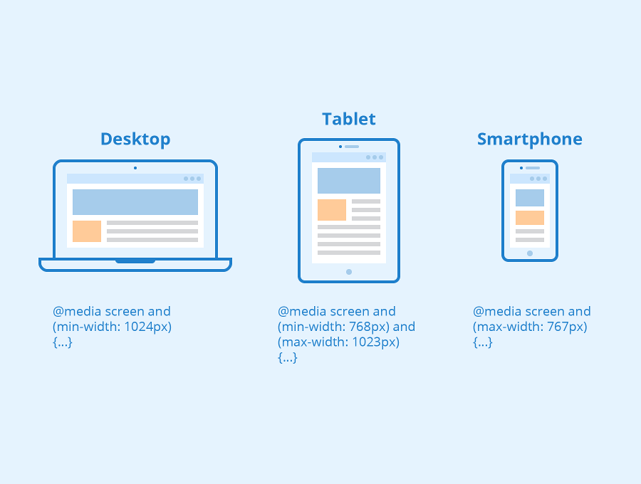
Breakpoints in media queries
In the responsive layout of a web page, breakpoints are set for the correct display for certain viewport sizes. A breakpoint is a condition that results from media queries that changes the layout of a web page at a particular display size. We recommend that you start with the design for the smallest output device (smartphones) when you layout a responsive web page and then adapt it for tablets, laptops, and even large monitors with breakpoints and CSS. A breakpoint and the corresponding CSS have to be defined whenever the display is no longer consistent. CSS in this media query only overwrites the styles that are changed by the breakpoint. Breakpoints in CSS media queries are defined by specifying a pixel value.
Example code for a breakpoint at 720 px width:
@media screen and (max-width:720px) {
/*CSS code for devices with a maximal width of 720 px */
}
To ensure correct display on each device, a viewport meta tag has to be integrated into the head area of HTML code. This meta tag tells browsers how to handle the dimensions and scaling of the page. The syntax is:
<meta name="viewport" content="width=device-width, initial-scale=1.0">
With “width=device-width” browsers are instructed to use the width of the screen in device-independent pixels. The directive “initial-scale=1.0” guarantees a 1:1 relation between CSS pixels and device-independent pixels.
Related links
- https://developer.mozilla.org/en-US/docs/Web/CSS/Media_Queries/Using_media_queries
- https://www.w3schools.com/css/css_rwd_mediaqueries.asp
Similar articles
