User signals are visible signs that indicate whether or not visitors are satisfied with a website.
That’s why optimizing these signals is closely related to improving the user experience (UX).
Why is this so important? You can think of a positive user experience like rolling out a virtual red carpet for your visitors. It encourages them to stay, explore, and take action – whether that means making a purchase, registering with your site, or simply coming away with a positive impression of your brand.
But that’s not all. With the release of the Page Experience update in late 2021, it’s clear that search giant Google has a soft spot for sites with a great user experience and rewards them in its rankings.
In this guest post, SEO expert Dennis Redder explains the most important user signals and how to measure them. He also gives tips on how to optimize these signals and briefly touches on the controversial debate about whether user signals are ranking factors or not.
If you’re already familiar with terms like CTR, bounce rate, or return-to-SERP rate, feel free to skip straight to the tips!
Explaining the most important user signals
In this section, we’ll examine the most important user signals. Each of them could easily warrant its own article, so if you want more in-depth insights, follow the links provided in each section.
Click-through rate (CTR)
The click-through rate is the ratio of clicks to impressions in Google’s search results. For example, if your website’s search result is displayed 100 times and clicked 10 times, the CTR is 10%. Keep in mind that the CTR is highly dependent on how the search engine results page (SERP) is designed and how well your URL ranks for particular keywords.
In general, CTR can be measured at various touchpoints in marketing, such as the number of clicks on a particular ad compared to its impressions. For the purposes of this article, however, we’ll focus on CTR in search engine results.
Bounce rate
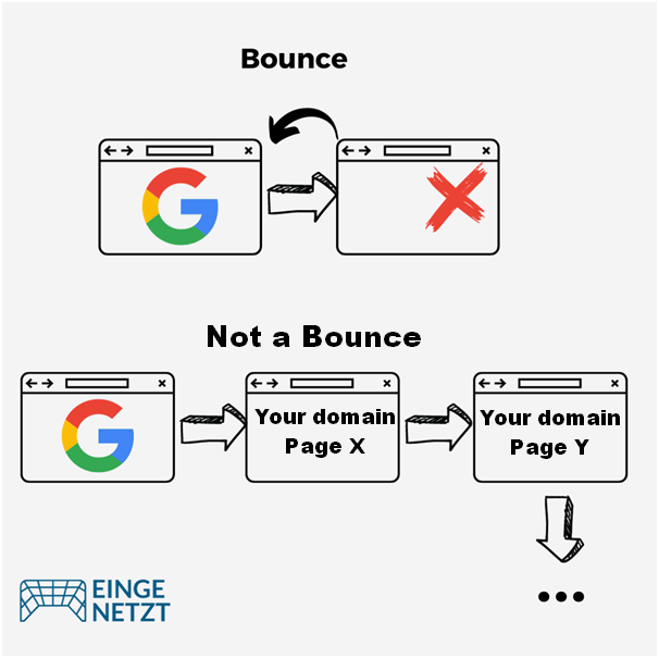
The bounce rate measures the percentage of users who leave your website without any further interaction. For Google, a bounce is defined as a single-page session, meaning a website visit where only one page is viewed and no further requests are sent to the Google Analytics server.
However, Google now considers the engagement rate (explained in the next section) to be a better alternative.
Engagement rate
With the launch of Google Analytics 4, Google introduced a new metric to measure user interaction: engagement rate. This metric calls any session an “engaged session” if it lasts longer than 10 seconds, includes a conversion event (such as buying a product), or has more than one page view.
Average engagement time
Average engagement time, or time-on-site, is the amount of time users spend on a particular URL or domain. In general, it’s desirable to increase this time, as this could ideally lead to an improved conversion rate. It’s usually beneficial if a user spends time on multiple URLs of your domain during a single session.
Time-on-site is also called dwell time. While time-on-site is the traditional term, Google’s latest version of Analytics has renamed this to “average engagement time,” which I’ll use here for consistency.
Return-to-SERP rate
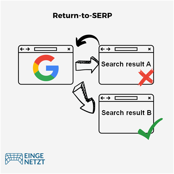
Return-to-SERP refers to when a user clicks on a search result and then returns to the search engine results page (SERP), possibly to visit another page listed in the results. This behavior is often interpreted as an indication of user dissatisfaction or disinterest.
But it’s important not to jump to conclusions too early – it’s normal for user behavior to be more complex than you’d expect. For example, users may open multiple search results in new tabs or jump back and forth between the search results page and the search results (also known as “pogo-sticking”).
As a result, the meaning of the return-to-SERP rate tends to be quite vague. Google cites this fuzziness, or “noisy signals,” as the reason it claims not to use user signals as a ranking factor. But we’ll go into more detail on this topic later. As a site owner, there’s no way for you to see the return-to-SERP rate.
Now that we understand the key user signals and their metrics, the next question is where to find this information about our site. So let’s dive into that.
Measuring user signals
Depending on the specific user signal you’re interested in, the source of information may vary. For this discussion, we’ll focus primarily on Google Search Console and Google Analytics.
It’s worth noting that Google Analytics is not the only web analytics tool available. Matomo Analytics is an alternative you might consider. In addition, other search engines offer tools similar to Google Search Console, such as Bing’s Webmaster Tools.
Measuring the click-through rate
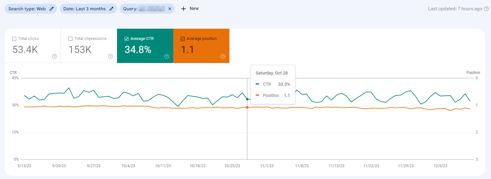
Google Search Console shows you the click-through rate (CTR) from Google’s search results to your site. To find this data, navigate to the left menu and select “Performance > Search results.” Then select the “Average CTR” box (the third box from the left).
You can specify the time frame you want to look at by using the “Date” filter.
Here are a few things to keep in mind:
- To get meaningful results, focus on the CTR for individual search queries or keywords. Although Google will display the average for your entire site, that’s like knowing the average body temperature of all patients in a hospital.
- The CTR is heavily influenced by your ranking for that keyword and the structure of the search results page. Consequently, changes in CTR don’t necessarily reflect changes in user experience, especially if the keyword ranking and SERP are also changing. As a result, how to interpret changes isn’t always straightforward.
- For queries that receive few clicks, CTR can vary significantly from day to day. That’s why it can be helpful to look at the average over a longer period of time.
Measuring engagement rate and bounce rate
In the latest version of Google Analytics, the bounce rate was temporarily removed, but has since been reinstated. You can now view it alongside the engagement rate in Google Analytics 4.
Google provides a useful guide on how to view your engagement rate and bounce rate in GA4.
Measuring time-on-site
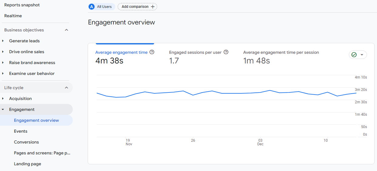
The time-on-site metric, also known as “average engagement time,” is also displayed in Google Analytics. You can take a closer look at time-on-site by navigating to “Reports – Engagement – Engagement overview” in the left navigation bar.
To view this metric on a page level, you’ll have to check the “Pages and screens” report.
Measuring the return-to-SERP rate
Unfortunately, the exact return-to-SERP rate isn’t available. As mentioned above, it’s a somewhat fuzzy metric, which may explain why Google doesn’t provide it.
However, Google Analytics lets you analyze engagement rates for different traffic sources in the “Traffic acquisition” report.
Reports > Life cycle > Acquision > Traffic acquisition
If the engagement rate for the “Google” traffic source is relatively high, you can indirectly infer a low return-to-SERP rate.
Unlike the bounce rate, the engagement rate counts a stay of more than 10 seconds as an interaction. This means that in the example above, 71.32% of users coming from Google spend more than 10 seconds on the page or interact with it. That’s definitely an indication that the page is meeting many users’ search intent, and only a few users are returning to the search results immediately to try another page.
However, it’s important to note here, that users might still return to the SERPs later on, so this is just a very rough estimate of the Return-to-SERP rate.
Are user signals a Google ranking factor?
Now we understand the most important user signals and how to measure them. But before we dive deeper, I want to address a hotly debated topic: whether some of the user signals mentioned here are direct ranking factors for Google. This debate generates a lot of discussion among SEOs.
Google denies it. However, those who have been in the SEO game for a while know that Google’s denial doesn’t necessarily settle the controversy.
One user signal that’s considered a prime candidate for being a ranking factor is the click-through rate. Whether that’s actually the case remains unknown, however. Some experiments, studies, and arguments support the idea, while others weigh against it.
What’s certain is that Google collects a huge amount of data on user behavior every day. Personally, I find it hard to believe that they don’t use this data to improve the quality of their SERPs. Signs keep popping up that that’s exactly what they’re doing.
Ranking factor or not, one thing is clear: No site will succeed if its users are unhappy. That’s why it makes sense to keep an eye on the relevant indicators and strive for continuous improvement.
In the next section, I’ll give you 10 ideas on how to do that.
10 tips for optimizing user signals
1. Consistent content & messaging
Users typically come to your site from a variety of platforms, including search engines, social media, and others. To keep them engaged, it’s critical that your content delivers on the promises made on those sites. This is especially true for content presented through search engines.
Let’s take a closer look at why consistency between your website and the search results page is so important.
Understanding search intent
In modern SEO, search intent is without question the key concept. The assumption is that every search query has a specific user intent behind it.
Each search term may be associated with one or more dominant search intents that are valid for most users. To “get the click,” you need to thoroughly understand what the intent behind your target keyword is. You also need to make sure that your content satisfies this intent.
So the first step is to identify the search intent so that you can design your search results to ensure a high click-through rate. The goal is to signal to searchers that they’ll find answers to all their questions and needs on your site (more on this in a moment).
If you successfully entice someone to click, don’t disappoint their expectations! Search results represent a promise to users of what they can expect from your site, and your content needs to fulfill their expectations. Each user will come to your site with their own particular intentions. It should be immediately clear to them that the content you provide corresponds to their intent.
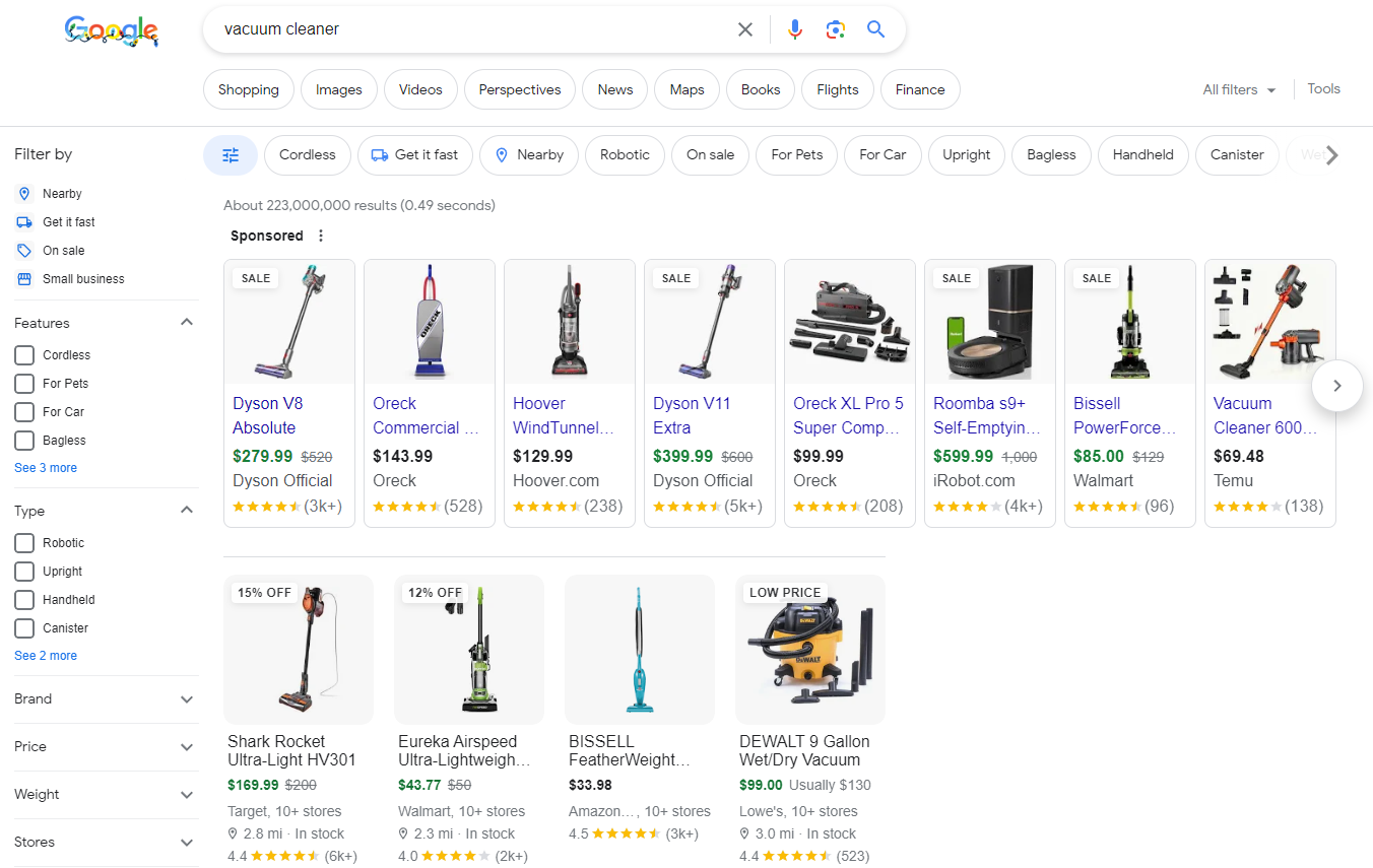
For example, consider a search for the keyword “vacuum cleaner.” You’ll be bombarded with ads in the search results, and all the organic results will be either product or product category pages – a clear indication that Google assumes people searching for “vacuum cleaner” intend to buy one.
This means it makes no sense for you to compete in this space with a blog article on “How does a vacuum cleaner work?”.
Optimize your title & meta description
Google takes a lot of liberties with the presentation of its search results and might rewrite the titles and descriptions you have defined for your pages. However, with the right approach, you can often ensure that your title tag and meta description appear in these results.
For example, for the keyword “SEO software,” these elements look like this:
It’s up to you to design these elements to most effectively show users that your site has what they’re searching for. This requires fine-tuning your title tag and optimizing your meta description in order to attract more clicks.
Also, keep in mind that Google’s 2021 title update resulted in an increased number of title tag rewrites. However, with the right wording, you can prevent this from happening to your title tags.
2. Optimizing page load speed and Core Web Vitals
Core Web Vitals are a set of factors that Google considers important to the overall user experience of websites. They include three specific page load and interaction metrics:
- Largest Contentful Paint (LCP) measures load performance.
- First Input Delay (FID) relates to interactivity.
- Cumulative Layout Shift (CLS) evaluates the visual stability of the page.
In April 2023, Google announced that FID would be replaced by the INP metric (Interaction to Next Paint) in March 2024.
Since the Page Experience update in late 2021, Core Web Vitals have had a direct impact on Google rankings. That means that optimizing them can improve both the user experience and the ranking of your site.
Practice has shown that there are certain factors that have a particularly strong impact on Core Web Vitals and page speed in general:
- Images:
Images should be provided with appropriate compression, in different sizes for different screens, and with height and width attributes in HTML.
- TTFB (Time to First Byte / Server Response Time)
If the server’s first response takes too long, it will be almost impossible to pass the Core Web Vitals test. For example, if you’re running a WordPress site, it’s essential to use server-side caching. For sites with many international visitors, using a CDN is also necessary.
- Too many server requests
After the initial server response, numerous additional requests are sent to the server from the website’s HTML code, such as requests to retrieve CSS or JavaScript files and images or fonts. Ideally, the number of requests should be kept to a minimum.
However, if you run a WordPress site with many plugins, each plugin may load its own JS and CSS files. Page builders also often load many different scripts and are frequently the reason why websites are slow. Ironically, optimization plugins like Autoptimize can provide a solution in this case. But in general, it’s a good idea to use as few plugins as possible.
For more information on how to correctly measure and optimize the Core Web Vitals, see this Core Web Vitals guide.
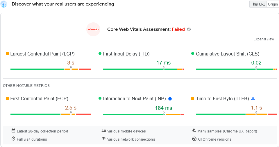
By the way, Core Web Vitals will only affect your rankings if enough users visit your site. You’ll know if this is the case when you see real user data in the Core Web Vitals section of Search Console or in the Google Pagespeed Insights tool.
This is what it looks like when there isn’t enough data:
And this is what it looks like when there is enough data:
3. Clear “above the fold” content
The term “above the fold” originated in the newspaper industry. It refers to anything visible above the fold of a physical newspaper. Simply put, it means any content that can be read without having to open the paper. The most attention-grabbing headlines are always printed above the fold, making them immediately visible on the newsstand and enticing potential readers to make a purchase.
To draw a parallel in the digital world, “above the fold” refers to the immediately visible area of a website – the part you see without having to scroll down.
To reduce bounce rates, it’s critical that users immediately understand what to expect from your site. This includes ensuring that what they see on your site is what they were promised (on search engines, social media, ads, etc.) before they clicked on the link that brought them to your site.
Of course, the above-the-fold area will vary depending on what kind of screen it’s displayed on. This is why responsive design is equally important. It ensures that the above-the-fold message is immediately visible on all devices.
One of the most important components of the above-the-fold message is of course the page’s main headline. It should be immediately visible and clearly communicate what the page is about so that visitors are motivated to continue exploring the site.
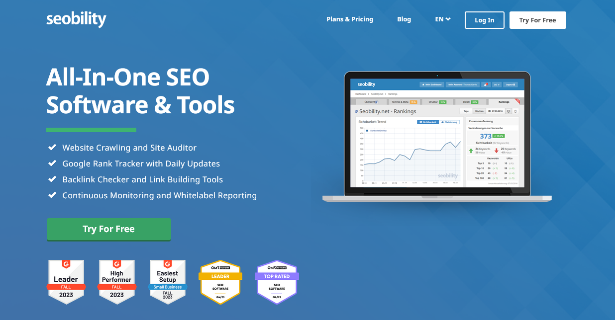
A good example of this is the Seobility homepage. At first glance, it’s clear what visitors can expect, highlighted by a single, prominent call-to-action.
4. Modern, targeted design
There are companies whose lobbies are filled with designer furniture costing hundreds of thousands of dollars, yet their websites look like a relic from 1999.
As Paul Watzlawick’s first axiom of communication theory states, “one cannot not communicate.” So what does an outdated website say about a company?
Your website design should always be up-to-date and aligned with the values that are important to your target audience.
The principle of “less is more” is often helpful. In my experience, flashy “designer websites” with spectacular effects often perform poorly from a marketing perspective (SEO, Core Web Vitals, conversion rate, etc.).
When in doubt, I always recommend a simple, functional design that doesn’t confuse users and clearly communicates the purpose of the site. The focus should always be on the user, not the designer’s yearning for self-expression.
5. Clear and visible site structure
A clear structure ensures a user-friendly website experience. Ideally, visitors should be able to find the information they’re looking for quickly and easily. Websites with an unclear structure, on the other hand, provide a poor user experience.
This can cause users to leave the site before there’s even a chance of a conversion. As a result, the bounce rate increases and time on site decreases.
Simple navigation
When it comes to navigation, simplicity is key! Images and captions can clutter up a navigation menu and prevent users from getting a quick overview.
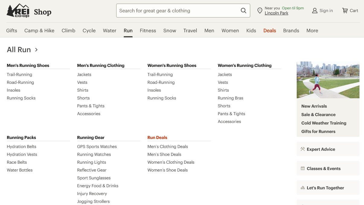
Some sites, such as larger online stores, require the use of “mega menus” with many links. In these cases, it’s useful to structure them with simple, keyword-like headings.
Using mobile-style menus (hamburger menus) on desktop websites is almost always a poor choice in user interface design. While not recommended, mobile-style menus are still quite common on desktop sites, even though studies have shown that they make the user experience worse.
Breadcrumb navigation
Breadcrumb navigation is a secondary navigation element that indicates where users are within the hierarchical structure of a website. It’s typically arranged in a horizontal list at the top left of the page, with each link representing a particular step back to the homepage.

The term “breadcrumb” comes from the fairy tale “Hansel and Gretel,” in which the main characters leave a trail of breadcrumbs in the forest so they can find their way home.
For online stores with deep hierarchies, breadcrumbs are an essential element. By linking from each page to its parent page, they help not only users but also search engines to better understand a site’s structure.
6. Short paragraphs and clear, useful content
For online text, short paragraphs have proven to be far more engaging and effective than what’s typical for print publication. Our eyes tire more quickly when reading on a screen than reading print, but frequent opportunities for movement let us help reduce eye fatigue.
On the Internet, two sentences are often enough for a paragraph. This approach may be dismissed by people more familiar with writing for traditional print outlets, but if they express their doubts, you can refer them to Stanford University’s UX guide.
This approach to brevity is also implemented on the Seobility blog:
In general, shorter sentences have also been found to keep readers more interested, although it depends on the target audience. For example, if your target audience is highly educated, using more complex sentences may be appropriate.
To objectively assess how approachable the text on your site is for readers, quantitative measures of readability are invaluable tools.
No matter who your audience is or what level of education you are trying to reach, using active verbs in your writing is always preferable to the passive voice. Active voice not only makes text more accessible and relatable; it also encourages more reader interaction. Active sentences provide clarity and keep the reader engaged. For example, consider the sentence “Mary reads the book” versus the passive construction “The book is read by Mary. The first sentence clearly describes the action, while the second is vague and stylistically awkward.
Clarity also depends on the technical terms you use. Make sure you only use terms your readers are likely to understand. When in doubt, linking to a glossary can be a helpful tactic -which brings us to our next point.
7. The art of strategic linking
Internal links are a way to keep users on your site longer. As you learned in the section about bounce rate, Google doesn’t consider a site visit that results in a click on an internal link to be a bounce.
Make sure that your internal links refer to relevant pages, provide additional information or lead readers logically through your site. Link anchor texts should be concise and meaningful so that readers have a clear idea of where the link will take them.
Wikipedia is a well-known example of a website that gets internal linking right. In every article, you’ll find links to content that is mentioned and to the sources cited.
A particularly helpful internal link is the “call to action” – more on that in a minute. Systematic linking strategies, such as sections with related products on eCommerce product pages, have also proven effective.
For more details and optimization tips, check out Seobility’s actionable guide to internal link optimization.
8. Using faces correctly
It’s widely accepted that human faces capture the viewer’s attention. This is backed up by extensive research, so you will see many recommendations to use facial imagery, such as author portraits, on your site.
But be careful! Just because a face is successful at attracting the viewer’s attention doesn’t necessarily mean that it will be beneficial to the purpose of your website. One study of the use of faces on websites found that an author photo on a financial site actually decreased trust in the accuracy of the information presented.
So it’s wise to consider the use of faces on a case-by-case basis, and to use A/B testing when in doubt.
9. Calls to action (CTAs)
Calls to action (CTAs) directly invite your visitors to take action. CTAs are often linked to a button that users can click. a strong CTA might directly prompt users to take a specific action that you’ve defined as a conversion, such as “Buy Now” or “Subscribe to Our Newsletter.” Alternatively, “softer” CTAs often include phrases like “Learn More” or “Continue Reading” that act as intermediate steps toward a conversion.
Without CTAs, conversions are virtually impossible, which shows how important effective CTAs are.
In web analytics, clicking on a CTA button is usually considered further interaction with your website. So a visit won’t be counted as a bounce if the user clicks on a button, whether it leads to a different URL or adds a URL parameter.
CTAs are essential elements of any effective website since they provide clear instructions for the next steps users should take, and they encourage users to engage further with your content or make a purchase.
Here are some tips and best practices for maximizing the effectiveness of your CTAs:
- Use action-oriented language: Include a strong verb in your CTA to encourage action, such as “Download Now,” “Sign Up Here,” or “Buy Now.”
- Stand out with design: Make your CTA visible by using bold and contrasting colors that stand out from your website background. Leave enough white space so users can easily find and read your CTA.
- Placement is key: Place your CTA where users will naturally find it, ideally after a compelling piece of content that makes them want to learn more or take action.
- Provide clear value: Users want to know what they’ll get in return. Make sure your CTA clearly communicates the value or benefit the user will receive from clicking.
- Size: Your CTA should be large enough to attract attention, but it shouldn’t be so large that it distracts from the content.
- Test and optimize: A/B test different versions of your CTA to find out which messages, designs, and placements resonate most with your audience. Monitor the results and adjust your strategy accordingly. Note that Google has now discontinued Google Optimize, its A/B testing tool. However, commercial alternatives such as AB Tasty or Optimizely are available.
- Use secondary CTAs: If your main CTA involves a major commitment (such as making a purchase), consider adding a secondary, noncommittal CTA (such as “Learn More”) to engage users who may not be ready to go through with the main CTA.
- Be clear about the goal: Avoid vague CTAs such as “Click Here.” Instead, be explicit about what the user can expect from going through with the CTA. An excellent example of this is provided by HubSpot:
The user knows exactly what to expect from clicking on either button – not only because of the clear CTA, but also because of the surrounding text.
10. Visual content
The days when text alone could hold users’ attention are long gone. In the world of digital content, we’ve known for a long time that the pictures you see are as important as the words you read.
But it’s not just about eye-catching design. The focus today is on effortless and “brain-friendly” consumption of content. The goal is to provide your visitors with detailed information while requiring as little effort from them as possible. Research shows that the brain processes visual content up to 60,000 times faster than text. And if you can create a satisfying experience for your users, they are more likely to stick around.
Key visual factors to consider for your website include:
- clear and intuitive layout
- professional design that matches your content
- relevant and authentic imagery (try to use your own photos instead of stock images whenever possible)
- infographics and illustrations
- interactive graphics
- video content
Many website owners are hesitant to use infographics and illustrations because they think that creating them requires a great deal of effort. However, from an SEO perspective, this type of media can attract visitors via image search and generate valuable backlinks.
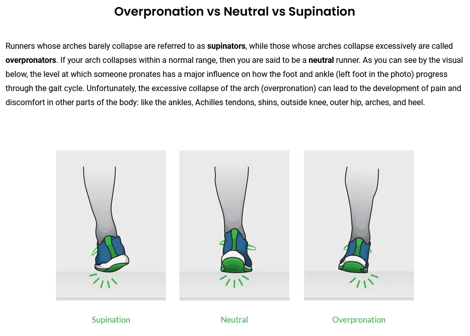
Here’s an example: If you’re buying running shoes online, one of the most important things to know is what type of shoes you need. That’s why running shoe retailer runningwarehouse.com provides a page that explains technical jargon like “overpronation” and “supination” with easy to understand illustrations:
In conclusion
Optimizing user signals is critical to a successful online presence, whether or not they directly affect your rankings. The ten tips in this article will give you several ways to improve the user experience, which will ultimately increase your conversion rate.
Beyond the individual tips, understanding your visitors, maintaining consistent content, embracing simplicity, and using familiar concepts will help you achieve success with your website.









Thanks for such valuable information Dennis. I would like to recommend ‘SimilarWeb’ as an effective method to have reference values for important metrics such as Average engagement time, Engagement rate and Bounce rate of our competitors. It really works very simply. Imponderable data for an SEO campaign.
Hey
Internal links are a way to keep users on your site longer. As you learned in the section about bounce rate, Google doesn’t consider a site visit that results in a click on an internal link to be a bounce.
I can’t understand what you mean
Hi there, thanks for your comment! This section means that you can use internal links strategically in order to keep website visitors longer on your site and improve your user signals. Because visitors who click on multiple links on your website will increase time on site and lower your bounce rate. (A bounce is a visitor who leaves your website without further interaction.) Hopefully this helps!