
Definition
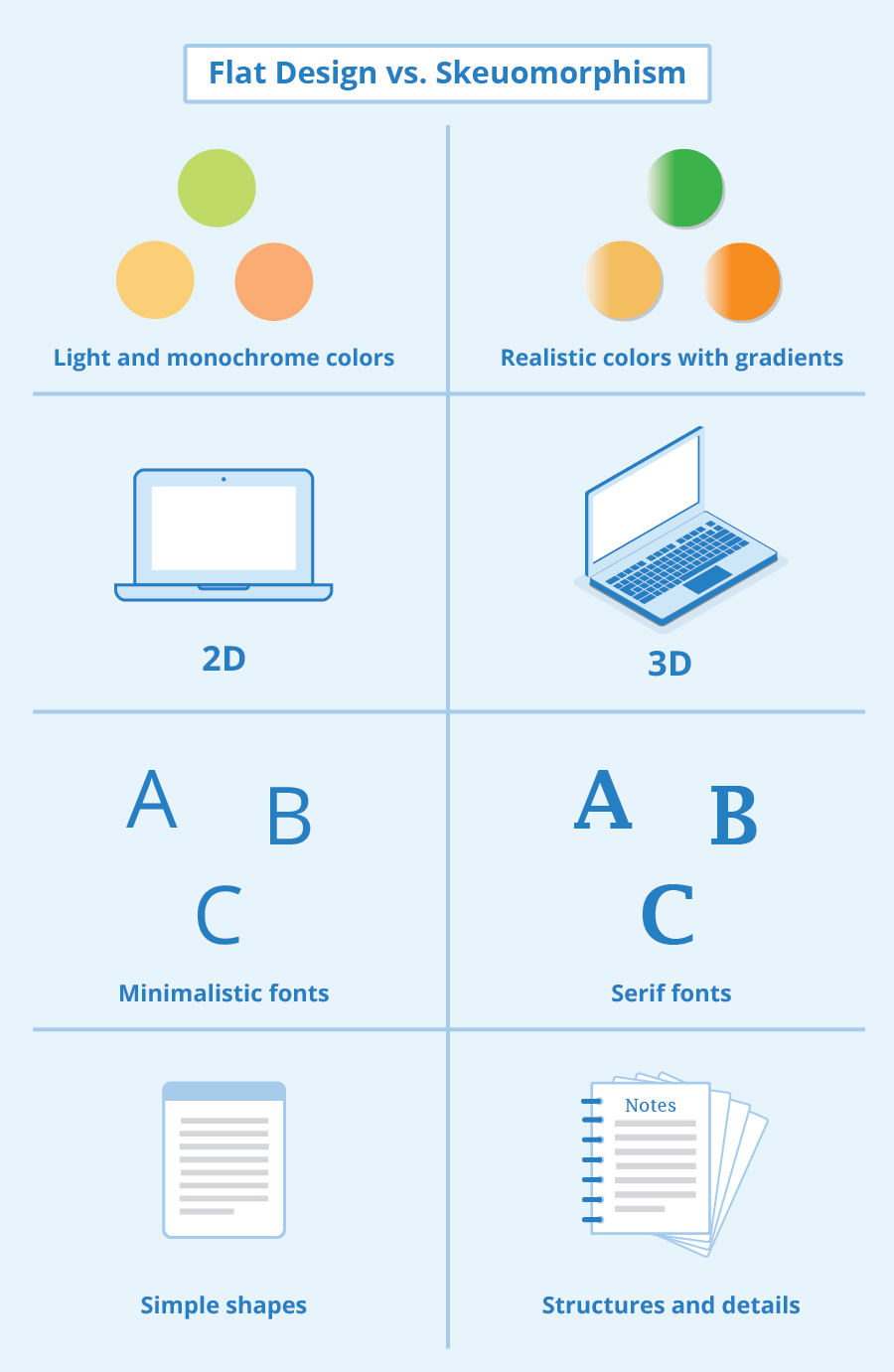
Flat design is a type of user interface design that focuses on simplified, two-dimensional elements and light colors. Flat design is often referred to as an opposite design to skeuomorphism, which creates the illusion of three dimensions on two-dimensional displays and screens by copying real-world structures and effects. Flat Design, which is centered around simple typography and geometrical elements, became popular with the release of Microsoft’s Windows Phone 7 in 2010, followed by the introduction of Windows 8, Apple’s iOS 7, and Google’s Material Design, which also use flat design.
However, flat design already originated in the 1950s. It first became known through the International Typographic Style also known as Swiss Style. The current designs were originally developed for responsive web design, where website content is scaled according to the device’s screen size. By using simple shapes instead of complex images, flat design helps ensure that responsive web pages can be loaded quickly, even with low-bandwidth connections.
Characteristics of flat design
Flat design is a purely two-dimensional style. It avoids shadows, structures, color gradients, and other means that add depth to an element. Every element in flat design, from frames to buttons, is smooth, without 3rd dimension, and sharp. Website designers usually use simple shapes such as circles, rectangles, or squares for this kind of design.
Focus on typography and color
Due to the simplicity of its elements, typography plays an important role in flat design. Designers usually use simple sans serif fonts to match the other elements’ minimalist design. Different font formatting tells users how to use each element on a page.
Colors are also an important aspect of flat design. The color palettes used are often much lighter and contain more shades than on other websites. While most web applications focus on a few (often only three) colors, designers tend to use six to eight different colors for flat design web pages. Some shades are used more often than others. Retro colors – including orange, purple, green, turquoise, and blue – are the most common ones in the original flat design, such as in Windows 8.
An example of a website designed in flat design can be found at pagelanes.com. As you can see in the following screenshot, the site largely avoids shading and other plastic elements and uses a very simple and clear design.

Screenshot with an example of flat design of pagelanes.com
Advantages and disadvantages of flat design
Flat design with its minimalistic elements helps users to focus on a website’s content. It improves usability through a clear visual hierarchy of shapes, colors, and fonts and allows fast and intuitive navigation in desktop and mobile applications. Flat designs are easy to customize in terms of adaptive and responsive design, easier for designers to implement, and reduce the amount of data required when accessing a website.
The minimalist design without spatial depth and structures is also the biggest disadvantage of flat design. An analysis by the Norman Nielsen Group found that flat design styles can compromise usability because users don’t always know which elements can be clicked. In addition, many flat design projects sacrifice important informative content in order to keep the design simple. In an effort to emphasize the clear, streamlined qualities of flat design, some designers fall into the trap of focusing too much on aesthetics, which can have a negative impact on a website’s usability. This is a particular risk for web and mobile design. Important functions and interactive elements can be hidden or visual hints that users are familiar with can be missing – just in order to create simplicity.
These usability problems were solved by a refinement of the original flat design called Flat 2.0 or Almost Flat. This design style, as well as Google’s Material Design published in 2014, use a small number of shadows, highlights, and textures to hint at three-dimensionality which can significantly improve usability.
Related links
- https://www.creativebloq.com/graphic-design/what-flat-design-3132112
- https://en.99designs.de/blog/design-history-movements/flat-design-and-semi-flat-design/
Similar articles
